Active Quarter
Northampton Active Quarter Branding
Year:
2024
Tools:
Branding, Strategy, & Direction
Category:
Branding

Overview
Northampton’s Active Quarter is a branding project focused on creating an identity that celebrates community, activity, and local heritage.
This was a ground-up identity project, requiring the creation of a logo and adaptable brand system that could be carried forward to the local council and stakeholders for approval. The goal was to establish a visual language that feels approachable, accessible, and distinctly representative of Northampton’s sense of place.
A Disconnected Identity for Local Activity
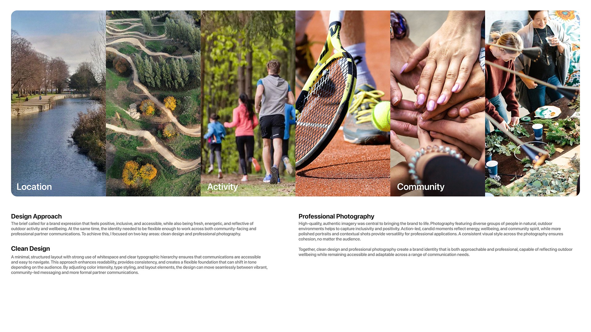
With no existing unified identity in place, Northampton struggled to connect its wide range of community-led and visitor-focused spaces, including nature trails, heritage sites, sports facilities, and the River Nene. To secure approval from local councils and stakeholders, the initiative needed a cohesive visual system that could appeal equally to residents and tourists, while remaining highly accessible, clear, and representative of the local landscape.
A Unified, Path-Inspired Brand System
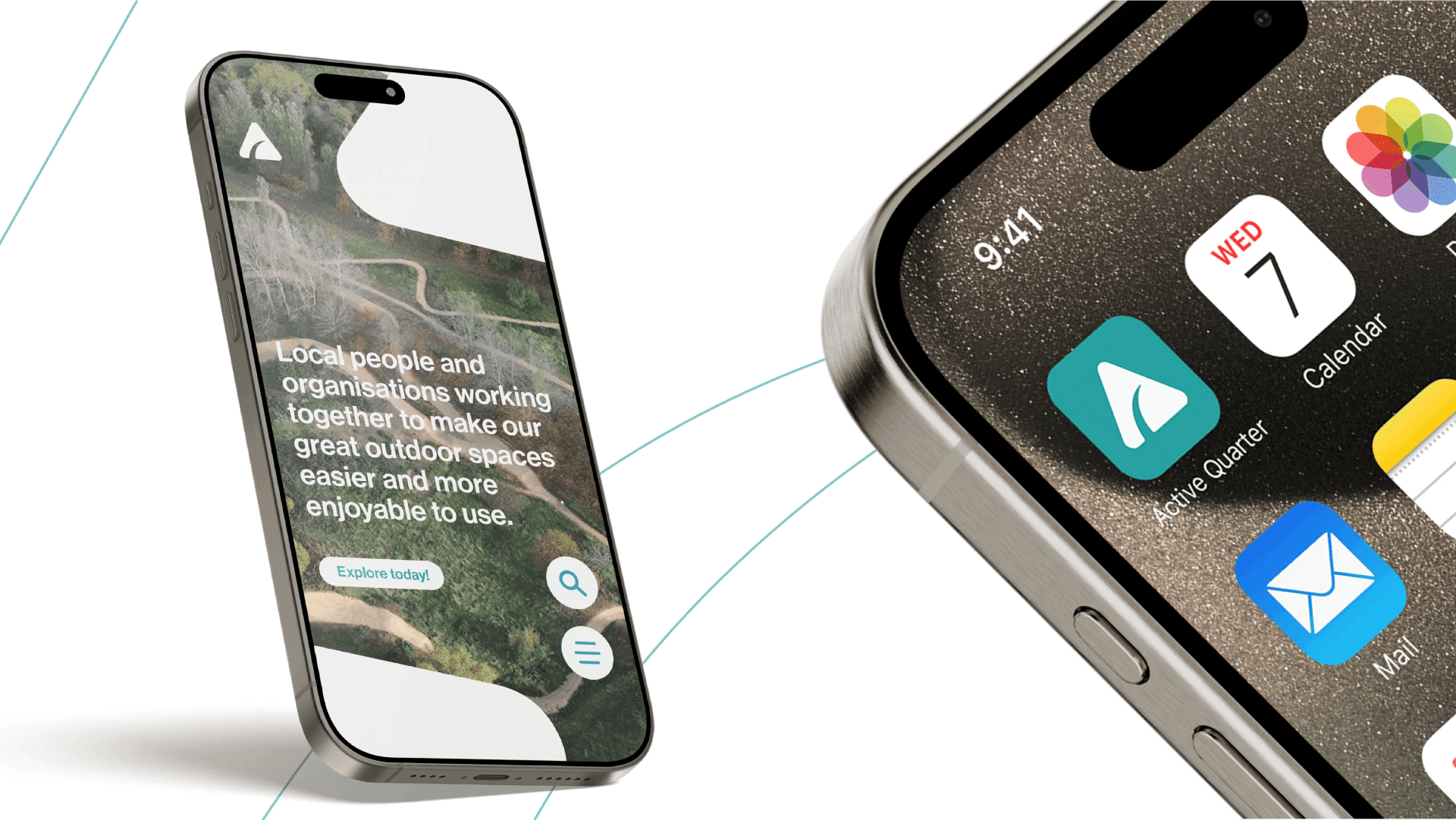
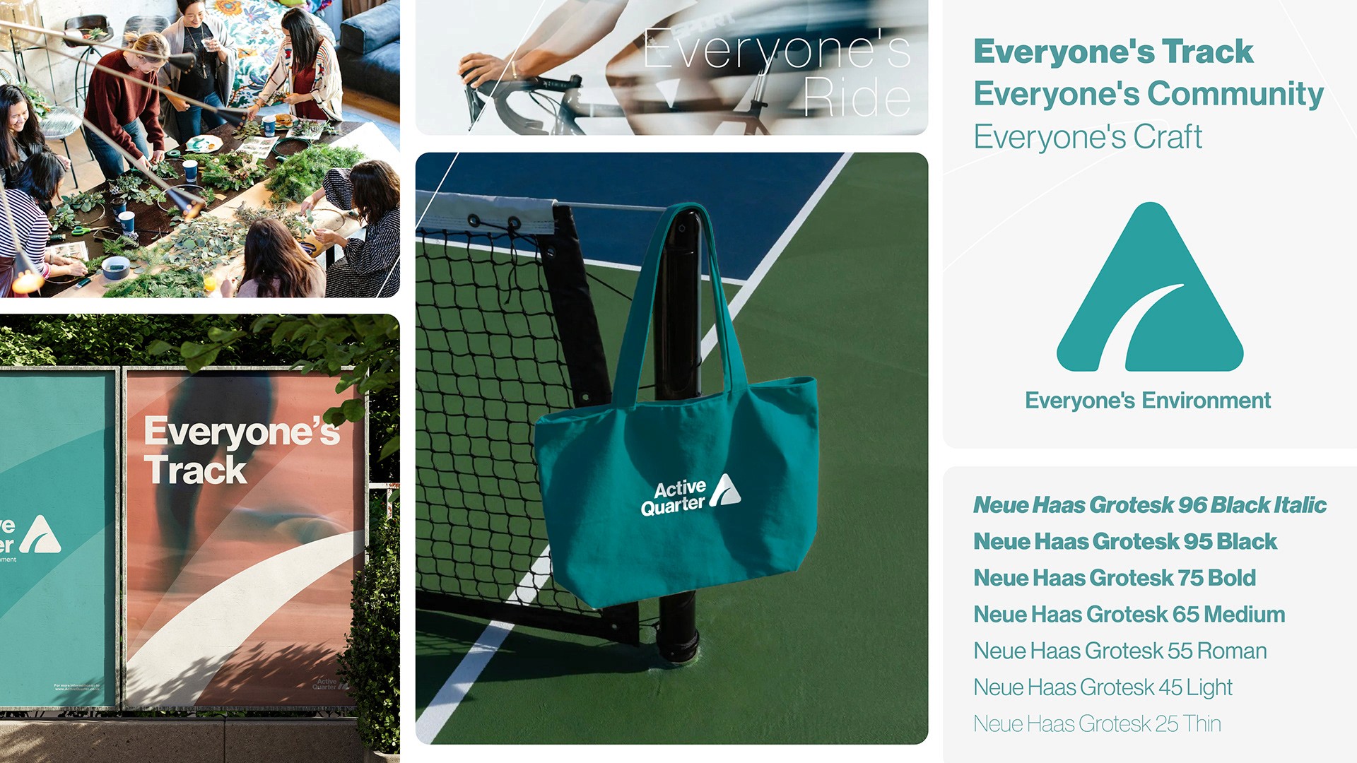
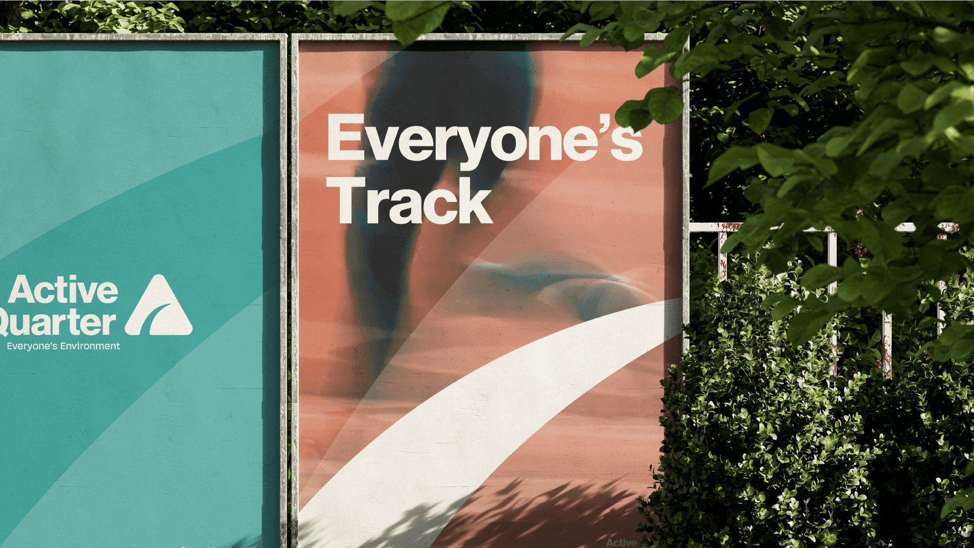
The final identity centres around a bold, abstract adaptation of the letter A, representing the “Active Quarter.” The lower indent of the letterform introduces an interpretive element, symbolising a path, track, or the River Nene, which runs through the heart of Northampton’s active zone. This subtle versatility allows the logo to resonate with multiple aspects of the area’s landscape and community life. A cohesive brand system was developed alongside the logo, including typography, colour palette, and adaptable graphic applications for both print and digital contexts. Example use cases demonstrated the identity’s flexibility across promotional materials, signage, and social media. The outcome is a modern, meaningful identity designed to grow with the initiative, helping the council and community present Northampton’s Active Quarter as a vibrant, welcoming destination for everyone.